


Ode to the Sea: Design Inspiration from the Dunes
A Stan Editions Story · Design Notes
A conversation with the tide, the salt air, and the small rituals that make a home feel lived-in.
Words & styling by Stan Verstraete · 5 min read

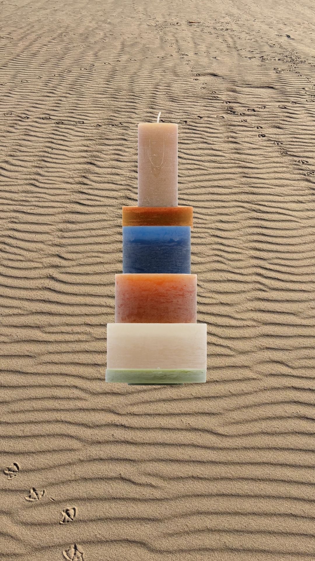
A Candl Stack set on rippled sand, the same tracks and textures that shape a walk along the dunes.
Living by the sea teaches a kind of attention that doesn't announce itself. You start to measure time by light on water, by the way salt gathers on glass, by how the wind never really stops moving through the dune grass outside. This is where a lot of my design thinking starts, not at a desk, but on a walk along the dunes with the smell of salt still on my jacket.
The dunes and their green
There's a particular green out here that doesn't show up much in interior design: the pale, almost silvery green of marram grass holding a dune together against the wind. It's a quieter green than the ones you see in gardens, closer to sage than to anything bright. I keep coming back to it as a color that works indoors precisely because it doesn't compete with anything. It sits behind warmer tones without asking for attention.
The ocean, salt air, and the palette it gives you
The sea itself hands you a full palette if you pay attention over a few different days. Flat, calm mornings are a pale, milky blue, closer to grey than to any postcard color. Late afternoon brings a deeper navy, almost the color of wet slate. And everywhere, holding it all together, there's sand: not one beige but a dozen, depending on how wet it is and what the light is doing. Even the air has a color to it, that faint salt haze that softens everything at the horizon.
Nothing saturated, nothing that shouts. Just tones that already know how to sit next to each other, because the coast put them there first.
The Palette
Sand Beige |
Deep Ocean Blue |
Teak Brown |
Light Dune Green |
Alabaster Stone |
Five tones pulled from the same walk: sand, ocean, teak, dune grass, alabaster.
Alabaster, and the logic of natural stone
Bring that same eye indoors and alabaster makes immediate sense. It has the same soft, weathered quality as a piece of stone that's spent years being turned over by waves: translucent in places, dense and matte in others, never perfectly uniform. That imperfection is the point. A material that looks machined feels wrong next to a window that looks out on the dunes. Alabaster, like driftwood, carries its history in its surface.
I think about stone the same way I think about sand: it's not one texture, it's dozens, and the interesting part is choosing which imperfections you want to live with.

Our Alabaster gift set, carrying the same quiet, weathered tones as the dunes outside. Shop the Alabaster gift set →
Teak, and why wood still belongs by the water
Teak has been the wood of choice for coastal furniture for a reason that has nothing to do with trends. It handles salt air and damp without complaint, and it ages into a silvery grey that looks like it belongs on a boat deck rather than in a factory. Indoors, that same wood warms up the cooler blues and stones instead of fighting them. It's the material that lets a room feel grounded rather than cold, even when the rest of the palette is all sand and sea.
Pairing teak with alabaster and a cool blue accent is, to me, the most honest way to bring a coastal feeling into a home that isn't actually on the coast. You're not decorating with a theme. You're using the same materials the location would choose for itself.
Building a stack in these tones
This is exactly the thinking behind the Ode to the Sea configuration: a Candl Stack built from sand beige, deep navy, warm brown and a touch of that dune green, arranged the way the tide arranges a shoreline rather than the way a showroom arranges a display. Nothing here is trying to look like the beach. It's just using the same quiet logic the beach already runs on.

Our bestselling Earthy Tones set carries the same natural, sun-warmed palette as the shoreline. Shop the Earthy Tones set →
If any of this resonates, you can build your own version through the configurator, or start from the Ode to the Sea combination directly.
Stan Verstraete
Designer & Founder, Stan Editions
Read more
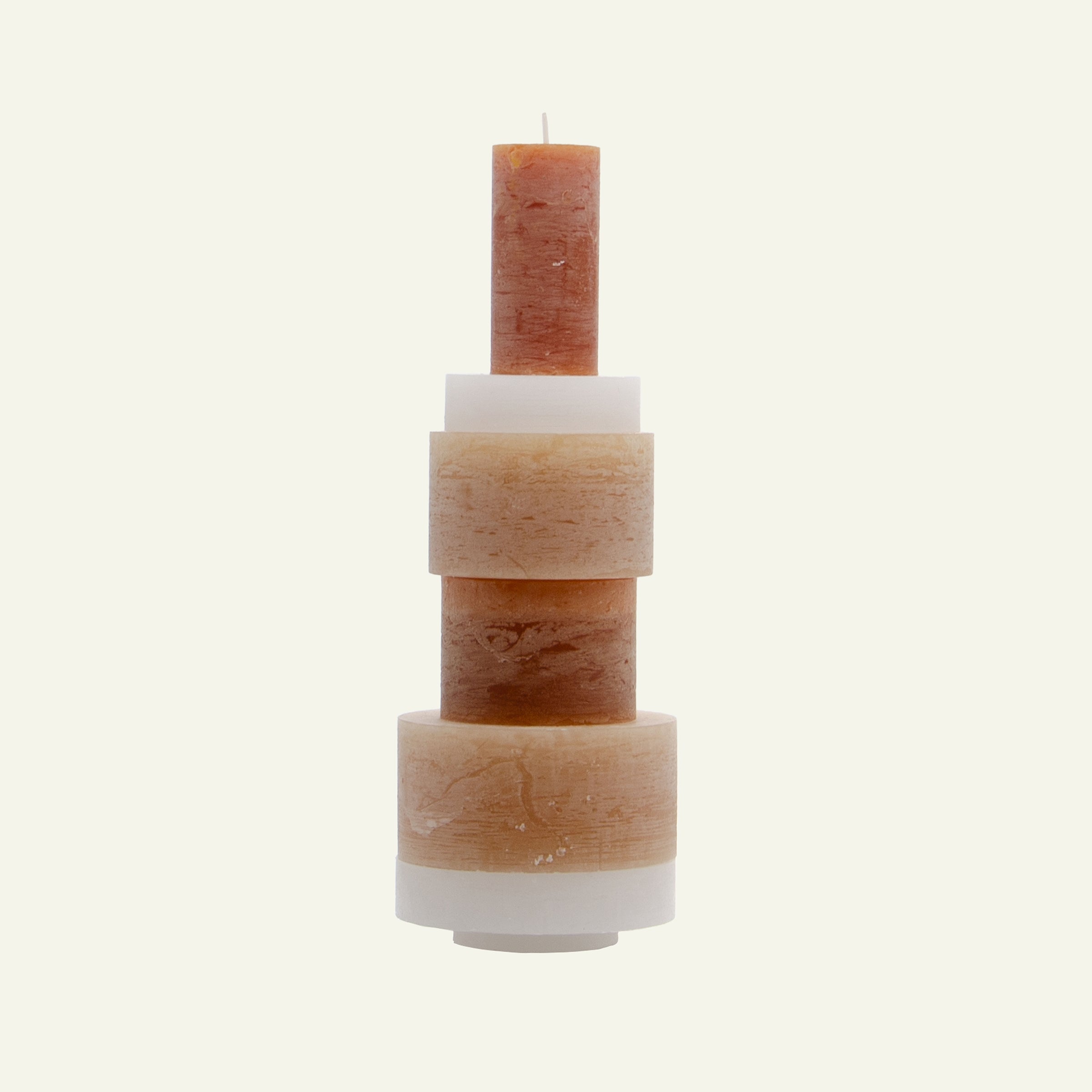
Looking for an original gift? Discover CANDL Stacks: candle sculptures you design yourself, with free gift wrapping and a personal message.
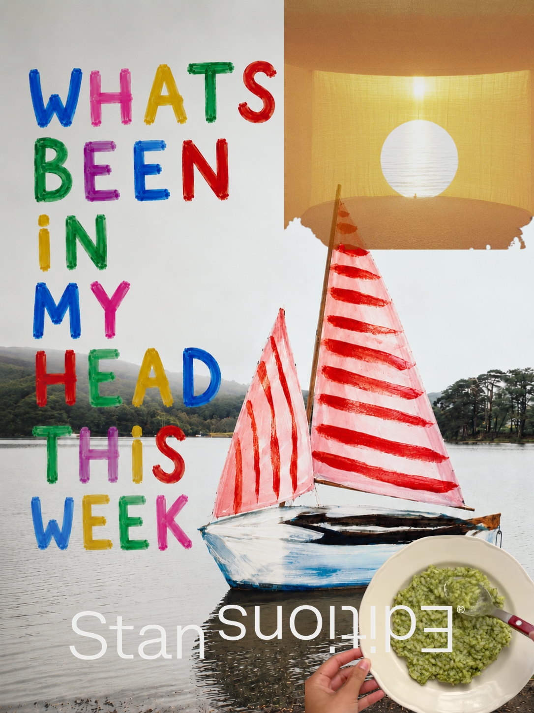
A green risotto styled like a Dior bag, a glowing canopy over the sea, and five other things I couldn't stop thinking about this week. Picked by me, personally.
Leave a comment
All comments are moderated before being published.
This site is protected by hCaptcha and the hCaptcha Privacy Policy and Terms of Service apply.